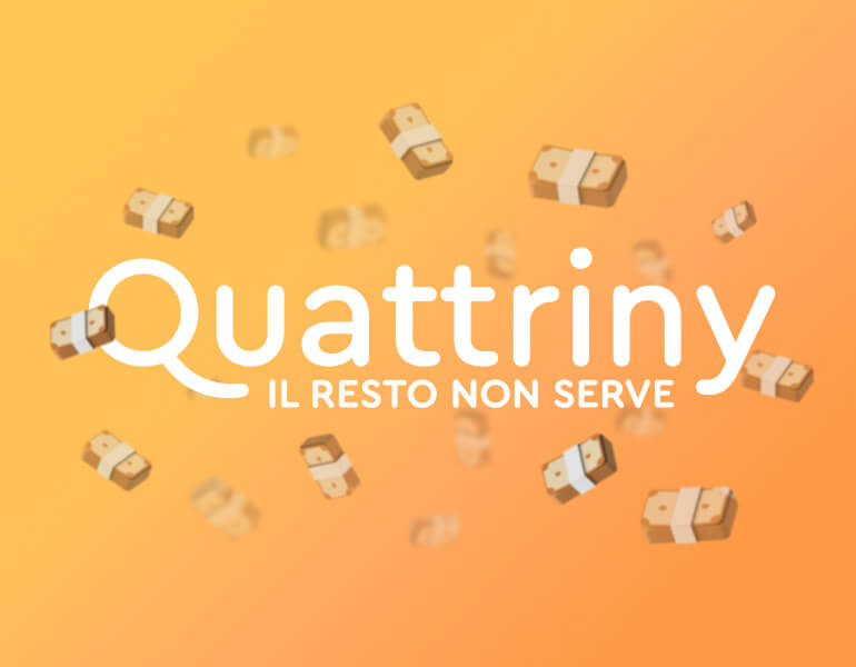
Quattriny
Ironic fictional-branding of a cash provider payment company
Project Overview
The core of the project is the ironic and friendly tone with which Quattriny brand communicates, ironically highlighting the contradiction of cash today. The project consists of promoting a fictitious company that embodies cash as a service through the creation of the brand, the launch campaign and other digital and physical artifacts. Quattriny comes from the colloquial word 'quattrini'. In Italian, this term is used to refer to money, especially cash. The corporate image and narrative are based on the aesthetics of banknotes in color, shape and text.
Team
F. Nozza, D. Zoppi
Role
Brand Identity, UX-UI, Art Direction, Keynote Presentation, Social Media, Coding (Wordpress)
Delivery
Art Direction and Copywriting Lab, 2023
Launch Campaign
The ironic tone of voice is evident in the launch campaign. The phrases on the posters use puns to ironise Italian stereotypes about cash, showing its sarcastic 'convenience' talking about green colour, clean recycling and no more pins or taxes.
Brand Application
Quattriny's identity is also structured in other applications. There is the website, which shows all the highlights of the service and where users can buy physical money in exchange for digital money, and branded gadgets, again related to the world of cash.
SourData